BRAND IDENTITY / FRAGRANCE
Deliverables / Brand Identity, Logo Design, Art Direction

Concept and Creative Direction
Purvelle began as an exploration of restraint in luxury fragrance branding. Having often gravitated toward more maximalist design, I wanted to experiment with a cleaner, more considered visual language that demonstrates how simplicity can create a strong identity.
Influenced by contemporary fragrance brands, luxury fashion and editorial design, I sought to establish a visual identity that feels elegant and minimal without sacrificing character. The challenge was to find a balance between distinctive design elements and an understated aesthetic.
Logo Prototyping & Process

Concept and Creative Direction
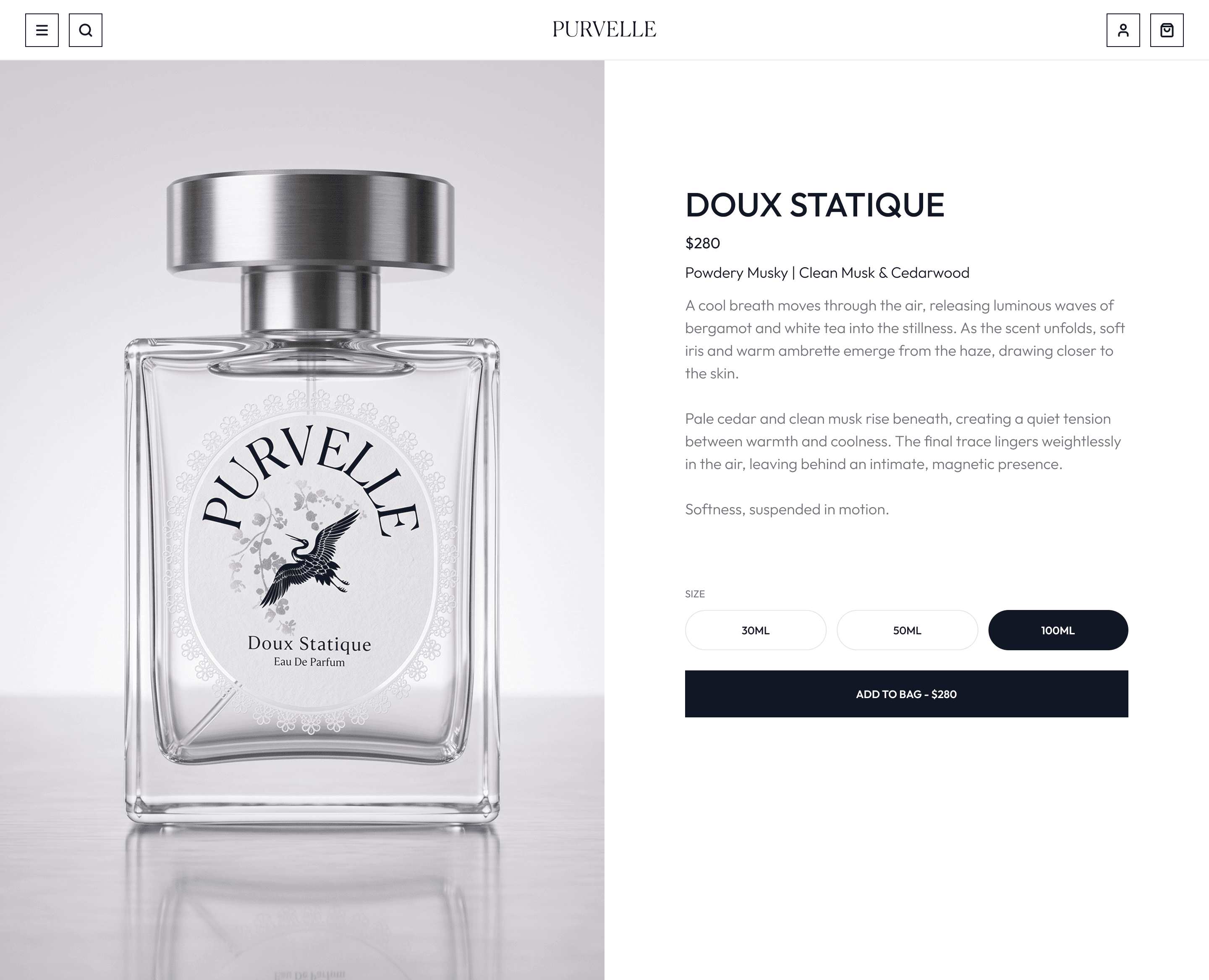
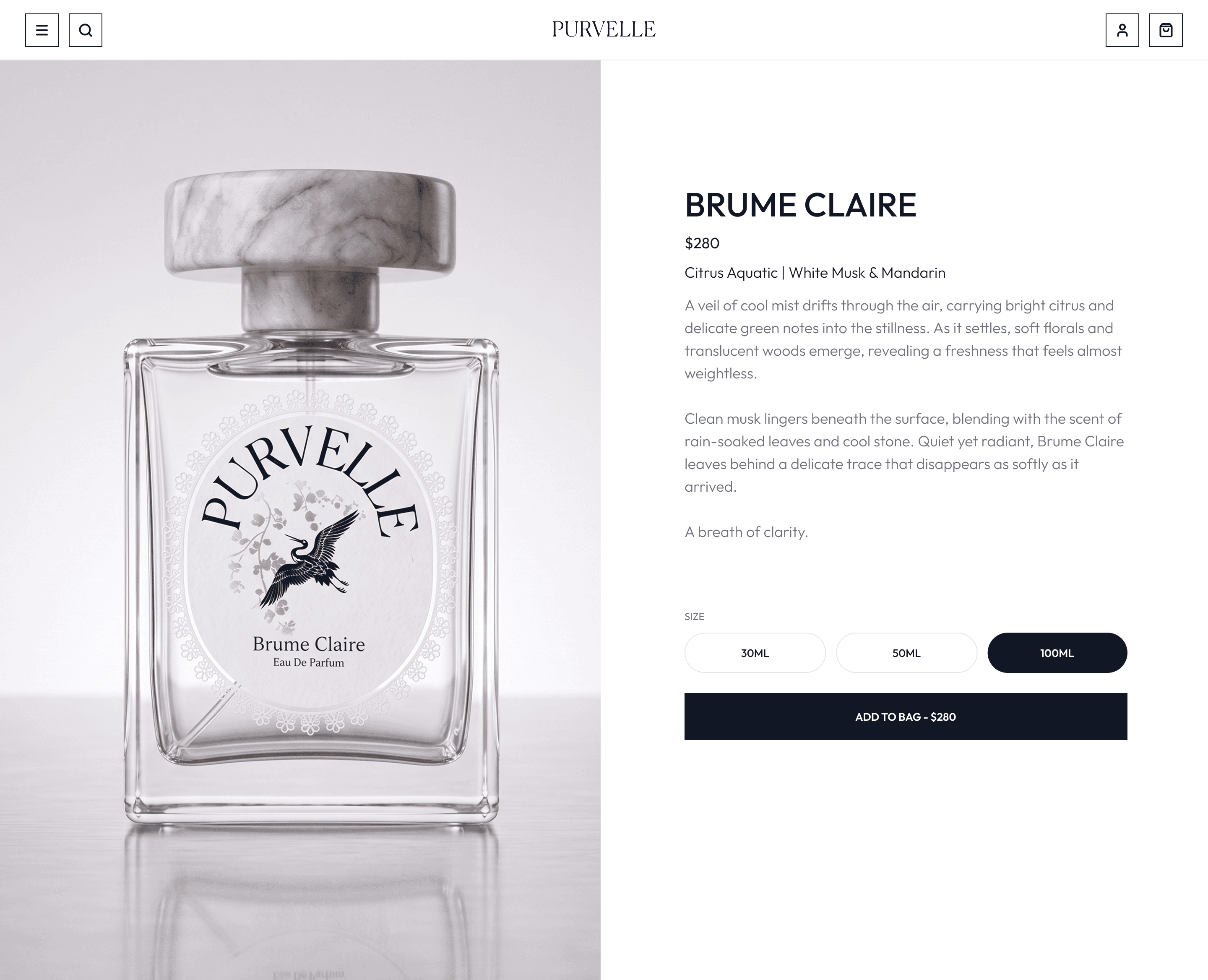
The Purvelle identity introduces ornamental elements into an otherwise restrained visual system. The logo features curved typography within an oval frame, accompanied by delicate lacing details and a crane illustration. These elements give the identity a distinctive character while maintaining its clean, elegant appearance.Rather than treating minimalism as the absence of detail, I approached it as a way to give individual elements greater purpose and visual significance.


Packaging Development
Initially, I explored more abstract bottle silhouettes as a way to establish a recognizable product identity. However, these unconventional shapes presented challenges when integrating the brand's minimal labeling and visual system.
I shifted my focus toward the bottle cap, retaining a traditional rectangular bottle that provides a clean surface for the label. Oversized cylindrical caps became the defining feature of the packaging, introducing a contrast in proportion and material without overwhelming the overall design.
The final prototypes explore two material expressions: marble and steel. Their contrasting finishes bring individuality to each fragrance while maintaining a consistent structural language across the collection.
PURVELLE - Doux Statique / Product Mockup Shots

PURVELLE - Doux Statique (Eau de Parfum) | Product Webpage
PURVELLE - Brume Claire / Product Mockup Shots

PURVELLE - Brume Claire (Eau de Parfum) | Product Webpage
Reflection
Purvelle allowed me to explore a more restrained approach to visual identity and product design. Through the development of the logo and packaging, I learned how selective ornamentation, materiality and proportion can create distinction without relying on visual complexity.The project reinforced the importance of finding a balance between expressive design and simplicity, demonstrating that minimalism can still retain a strong sense of character.
